Brand accents & logo companion
AOD / Brand direction / 01
Australian roots.
A fresh perspective.
One clear identity for the website and the wholesale app. Familiar blue, generous white space and the real AOD product family.
 Blue on white
 White on brand blue
Original artwork from the AOD product portfolio.
Keep the logo large, clear and easy to read.
01 / Colour
A little sky. A lot of clarity.
The working digital palette, developed from the supplied logo, packaging and Figma direction.
Primary actions & links
Headlines & strong contrast
Space, clarity & surfaces
Organic range & soft panels
Standard range & quiet backgrounds
02 / Typography
Warm headlines. Clear information.
The same two typefaces connect every screen.
Goodness starts
at the source.
Round, welcoming headlines. Sentence case. Room to breathe.
Australian milk.
A2 protein.
A2 protein.
Readable product details, simple forms and confident navigation. Regular, semibold and bold.
Aa Bb Cc 0123456789
03 / Product language
Two ranges. One AOD family.
Show the pack clearly. Always distinguish the organic range from the standard range.
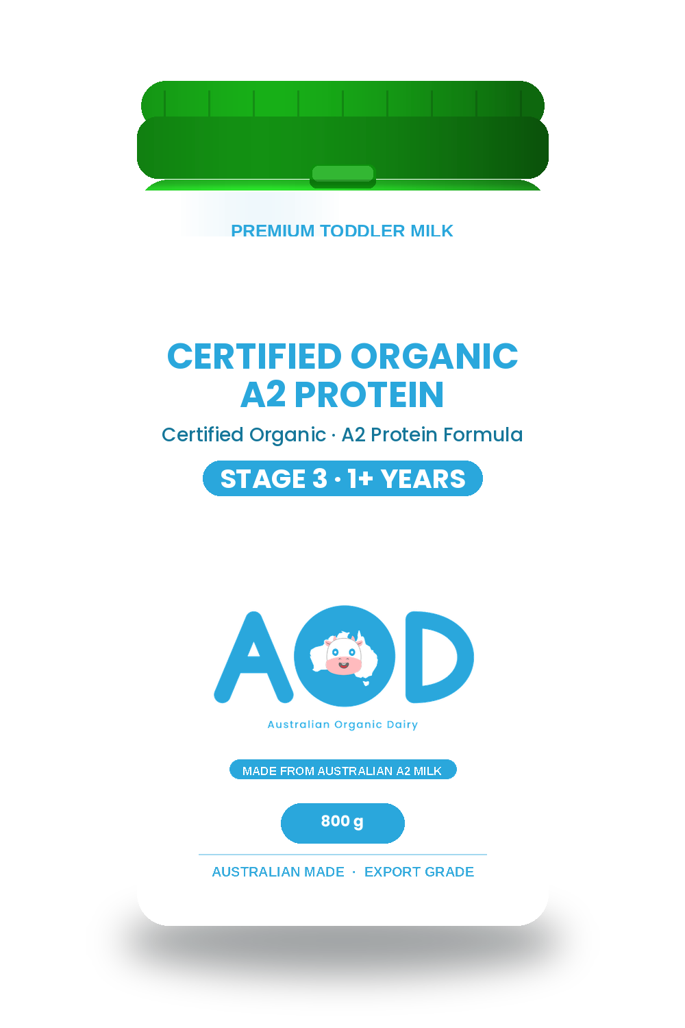
Organic rangeCertified Organic
Certified Organic
A2 Protein
Soft sky backgrounds, original pack artwork and a clear life-stage label.
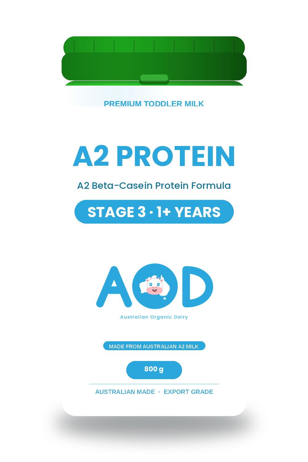
Standard range
A2 Protein
A separate non-organic range. Never use the organic label for these products.
04 / The experienceSimple, from enquiry
Simple, from enquiry
to shipment.
For importers, distributors and wholesale partners. One full container starts the conversation.
Show 1 FCL, 18 pallets and 5,670 cans together. Make the product mix easy to understand.
Keep development products, draft enquiries and demonstration order data clearly labelled.
Short, smooth transitions that support the task. Respect reduced-motion settings.